We are now almost four months into the year and boy what a year it has been. We have seen the major US equity indexes decline by 10, 15, and 20% for the Russell 2000. We have had multiple investment banks and pundits calling for recessions. Yields in Japan and Europe are negative. Not to mention that both the S&P 500 and Dow Jones are now positive or flat year to date. All this in just the first fourth of the Year!
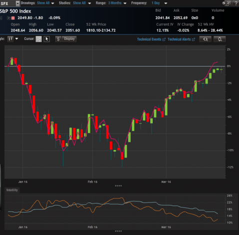
S&P500 compared to the Dow Jones (Pink), 3 month
Some of you might have remember a post I wrote called “
You May Want to Fly to Quality” were I outlined why you may want to allocate more towards things that are considered “Quality”some of the sectors that were performing at the time were Utilities and Consumer staples. I want to take a look at how it panned out now that we are essentially flat on the year on indexes.
Lets first take a look at consumer staples:

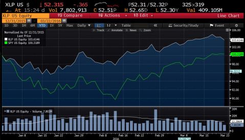
Here we see the Consumer Staples ETF (XLP) in white and the S&P 500 ETF (SPY) in orange, 1 year
This is a great chart because it shows the difference between the XLP and SPY below with a bell curve and standard deviations so we can see that currently the spread between the XLP and SPY is 1.6 stand deviation move (see the spread summery over the bell curve).
Here is a even better view of XLP vs SPY, roughly 3 month
The first thing you will notice is that the scale on the Y axis of the second chart is out of 100 despite XLP (white line) being $52.315. This is because I compared the two on a line chart so Bloomberg puts them in terms of percentage with 100 being 0%, so what we see is that the SPY (green) is up .3189% vs the XLP being up 3.6146%. That is a out performance of about 3.3% not too bad.
Time for Utilities:
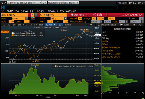
Here we have the Utilities ETF (XLU) in white and the S&P 500 ETF (SPY) in orange, roughly 3 month
I have to admit that I am suspect to a chart crime on this one. I didnt use the same time frame as the XLP chart so the returns for the SPY are inflated, but you can still see that the XLU returned 12.41% vs the SPY at 7.57% .
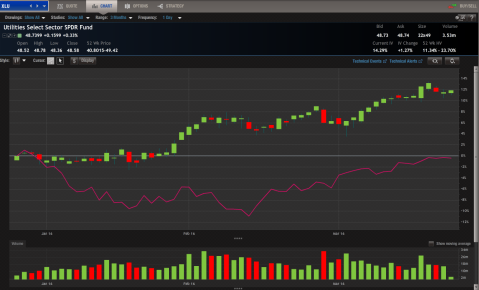
Here we have the XLU in candle stick and the SPY in pink, 3 month
On this chart we see that unlike the Bloomberg charts we have a scale purely in percentage and a white line representing 0%.The SPY is flat while the XLU is up over 12%. using the same return for the SPY in the XLP graph the XLU has outperformed the S&P by 12.09%. That is not bad for boring old Utilities!!
Now we are going to look at two different baskets that hold “Quality” stocks. The first is the iShares MSCI USA Quality Factor ETF (QUAL). The second is a index by Goldman Sachs High Quality index (Bloomberg ticker is (GSTHQUAL). I would like to note that the GSTHQUAL is a portfolio that you can invest in with Goldman Sachs. I must alos say I have received no form of payment from Goldman, I just knew this index was out there from their Weekly Kickstarter note.
QUAL:
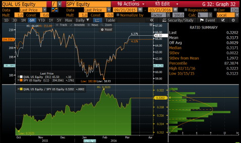
S&P500 compared to the Dow Jones (Pink), 3 month
I again must admit to a slight chart crime of not having the same time frame as the XLP chart. This time frame does help show that QUAL has had a solid leg of out performance over SPY for the last six months. In fact, from this chart we see that QUAL has outperformed SPY by 2.25%. We also see that the recent move is roughly a 1.3 standard deviation move.
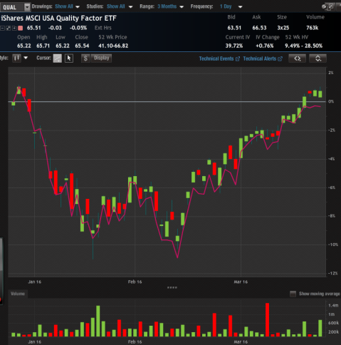
Here we have QUAL as the candle stick and SPY in pink, 3 month
Notice again that the white line represents 0%. Unfortunately when I took the screen shot it could not capture the performance notes for each, but they are up .77% for QUAL and down .32% for the SPY. QUAL outperforming the SPY by 1.09%. Again not bad for the first three months of the year.
And last but not least, the GSTHQUAL:

Here we have the GSTHQUAL (orange) and SPY (white), roughly 3 month
It is a little hard to see, but by each line there is the performance numbers. GSTHQUAL is up 2.3% while SPY is up .59% (again with the chart crime). We see on the right that the spread is almost right on the mean, only .35 standard deviations off of it.
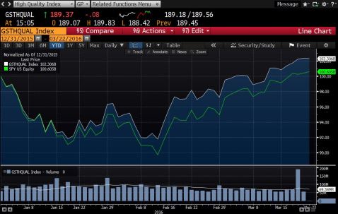
GTSHQUAL (white) and SPY(green), roughly 3 month
Here we get a better view on our Bloomberg performance graph. We see that GSTHQUAL really started to pick up as the SPY declined. Using the same performance numbers we see that the GSTHQUAL outperformed the SPY by 1.71%.
What I found interesting by these findings is that it payed to end up buying quality in terms of sectors rather than buying baskets of quality. I personally think that Quality can continue to outperform this year. I believe this because I expect it to be a rocky year for the markets. In January and early February we had a good portion of the S&P had been down 10% before the index did. We have also, now that earnings season is over, had two back to back quarters of negative earnings growth so we are technically in a earnings recession. With all this I believe quality will be the rock you want in your portfolio for the rest of this year.
*******Disclosure: I am long XLU, see my Positions page for exact dates
Feel free to chat about the post or markets via Twitter or Email!
